Calm Radio
Overview
CHALLENGE
CALM Radio is a music streaming service that specializes in calm and ambient music for those who wish to obtain calm and serene mind in their hectic life.
Their main challenge is that they are experiencing a low conversion rate from new users to subscribers.
MY ROLE
Conduct heuristic analysis of the site
Establish user flow for sign-up
Deliver low-fidelity wireframes to convey better experience for landing page and sign-up.
Team
Pivot Design Group
Heuristic Analysis 🔍
Landing Page
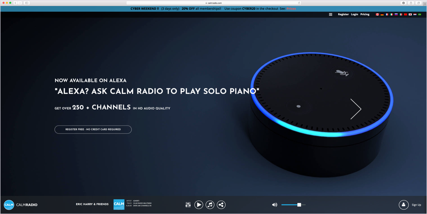
The marketing statements on landing page share more technical values, which does not relate the potential user on the emotional level.


New User Flow
The variety of genres and its visual presentation is crowding the screen, which overwhelms the user and there is no clear action of what the new user can do.
All interactive elements and content share the same hierarchy, which deters from the user’s focus on clear CTA.
Exploration 🎨
Landing Page
My first trial with landing page was to promote Calm Radio’s qualitative value propositions in first 3/4 of page through written content and imagery.
Lastly, I have mentioned the technical value propositions at the end, because they are considered to be secondary values to their brand. The purpose of this
New User Flow
For trial experience, I have leveraged a “questionnaire” customization, so the user would feel that the service of Calm Radio is curated towards their interest and goal
Client Feedback 💬
Landing Page
Although the client was satisfied with marketing statements, they desired it to be less cluttered and more action-driven.
New User Flow
The page appears to be too cluttering, which does not present the essence of “calmness”.
Client found that the personalization choice step (“I feel like” and “I like”) to be a hurdle in the experience of the user, rather than enhancing it.
The client has vocalized that I have to accommodate potential written articles and this content has to be available for the prospective subscriber.
Refinement 💅
Landing Page
Leveraging client feedback and more exploration, I have made the website more succinct in delivering its primary value propositions via hero banners. I have also introduced new layout of imagery and written content, so the site will be more visually appealing for prospective subscriber.
New User Flow:
For the trial experience, I have created more of “exploration” page where the user can discover platylist and sift through them via filters.
To accommodate the lifestyle articles and blog, I have created a section where the user can explore new trending article and supplementary content below.
What did I learn 💡
User experience designer doesn’t only advocate for the user, but they also have to understand the business requirements and identify opportunities where the business can benefit from user’s needs and address their painpoints.


